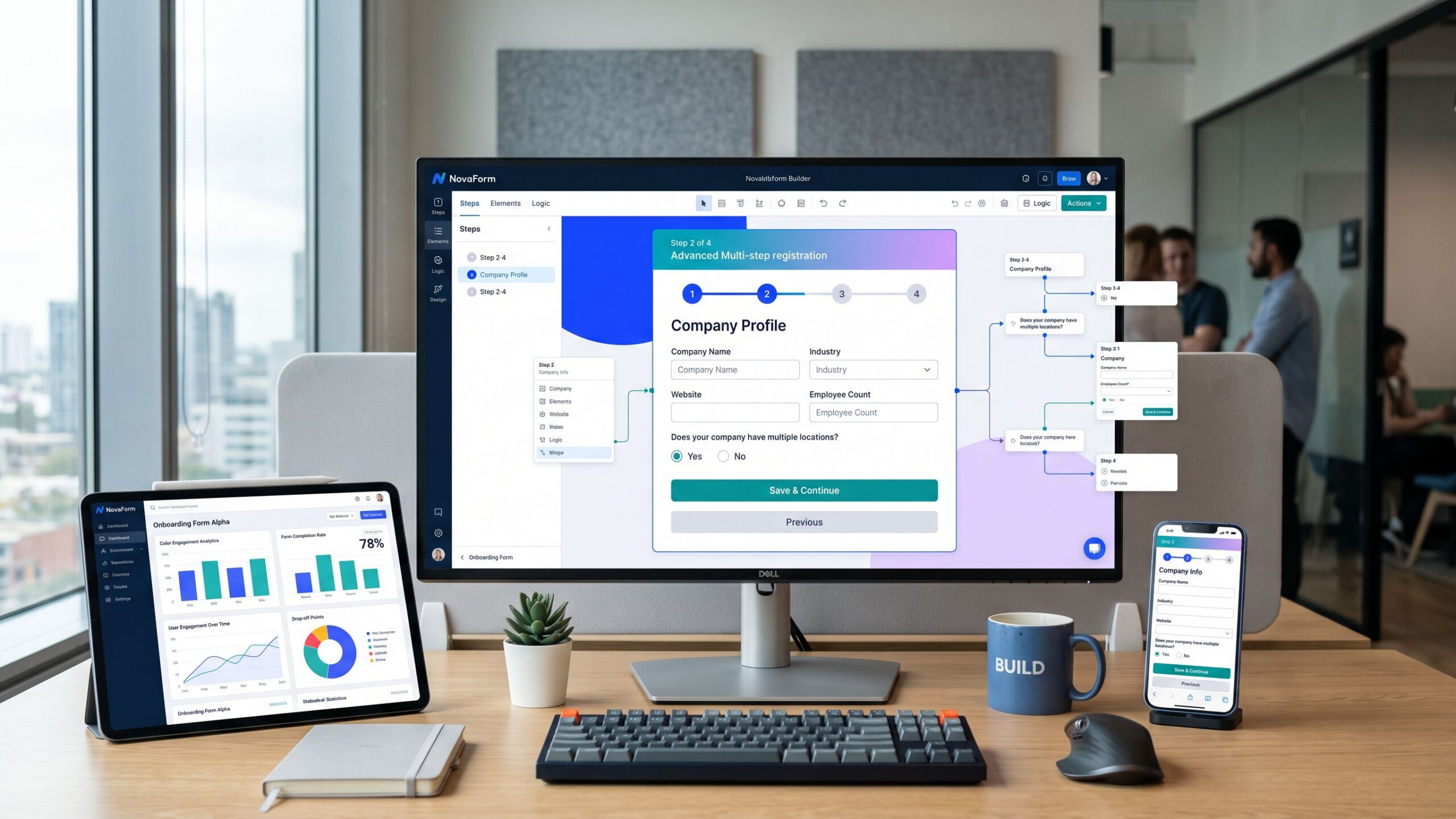
Imagine arriving at a website ready to request a service, register for an event, or complete an application, only to discover an intimidating wall of empty fields stretching endlessly down the page. What initially seemed like a simple task suddenly feels like paperwork, and the temptation to abandon the process becomes difficult to resist. Now imagine encountering the same questions divided into a series of short, organized steps, each presenting a manageable amount of information with clear instructions and visible progress. The experience immediately feels more approachable. This is the fundamental appeal of multi-step forms, one of the most useful design approaches for simplifying complex online interactions. Multi-step forms divide lengthy questionnaires into smaller sections, allowing users to complete information progressively rather than confronting every question simultaneously. They are commonly used for customer onboarding, lead generation, insurance applications, event registration, product customization, appointment scheduling, and online checkout processes. When designed thoughtfully, these forms can reduce perceived complexity, improve navigation, and encourage users to continue through longer interactions. However, splitting a form into multiple screens does not automatically improve engagement or conversion rates. Poorly designed multi-step forms can introduce unnecessary clicks, confusing navigation, unexpected questions, and additional frustration. The key is understanding how to organize information, communicate progress, minimize friction, and create an experience that feels natural from beginning to end. This comprehensive Nova Streets guide explores the design principles, practical techniques, software platforms, and optimization strategies behind successful multi-step forms, helping businesses create interactive experiences that balance visual appeal, usability, and measurable results.
What Are Multi-Step Forms and How Do They Work?
A multi-step form is an online questionnaire divided into two or more sequential sections rather than presented as one continuous page. Each section typically focuses on a particular category of information, allowing users to progress through the form in an organized sequence. A customer requesting a home renovation estimate, for example, might begin by selecting the type of project, continue by providing property details, choose a preferred timeline, and finish by entering contact information. Instead of displaying every question simultaneously, the form introduces each stage when it becomes relevant. Navigation buttons generally allow users to move forward and backward, while progress indicators communicate how much of the process remains. Some multi-step forms also use conditional logic to adjust the questions displayed according to previous answers. This approach is particularly useful when different users require different paths through the same questionnaire. Modern form-building software makes it possible to create these experiences using visual editors, customizable templates, branching rules, and integrations without extensive programming knowledge. Although multi-step forms can appear more sophisticated than traditional questionnaires, their primary purpose is straightforward: organize information into manageable interactions while helping users complete a clearly defined task.
Why Multi-Step Forms Can Improve User Engagement
One of the strongest advantages of multi-step forms is their ability to reduce the amount of information users must process at any given moment. When a lengthy form displays dozens of fields simultaneously, visitors may perceive the task as demanding before they begin. Dividing those questions into smaller sections can make the experience feel more manageable and provide a clearer sense of direction. Multi-step forms also create opportunities for progressive disclosure, a design principle that presents information only when it becomes relevant. Rather than overwhelming visitors with every possible option, the interface introduces appropriate questions as users move through the process. This can be especially valuable for complex applications, detailed product configurations, and service qualification questionnaires. Another benefit is the ability to establish a logical progression. Users can begin with straightforward questions before moving toward information requiring greater consideration. However, engagement should not be confused with the number of clicks or pages viewed. A form that requires excessive navigation may create more friction than a well-organized single-page alternative. The most meaningful measurements are successful completion, submission quality, user satisfaction, and the amount of effort required. Multi-step forms are most effective when each stage genuinely simplifies the experience rather than merely dividing an existing questionnaire into arbitrary pieces.
Start With a Clear Goal and Understand Your Audience
Before designing a multi-step form, organizations should identify exactly what they want users to accomplish. A customer inquiry form, employee onboarding questionnaire, insurance application, and online checkout process each require different information and levels of commitment. Understanding the intended outcome helps determine which questions are essential, how they should be organized, and whether a multi-step structure is appropriate. Audience expectations are equally important. A visitor requesting a quick product demonstration may expect a brief interaction, while someone applying for a mortgage will likely anticipate a more extensive process. Designers should consider the user’s motivation, familiarity with the subject, technical confidence, and device preferences. Questions that appear reasonable to an experienced professional may confuse someone encountering the process for the first time. A successful form should also communicate its value early. Visitors need to understand what they will receive after completion, whether that means a personalized quote, account access, appointment confirmation, or downloadable resource. When the purpose is clear and the questions feel relevant, users have a stronger reason to continue. This planning stage prevents one of the most common mistakes in form creation: designing an attractive interface before determining what information actually needs to be collected.
Organize Questions Into Logical and Meaningful Steps
The foundation of an effective multi-step form is thoughtful information organization. Each stage should contain questions that belong together naturally, creating a sequence users can understand without extensive explanation. For example, an event registration form might begin with attendee information, continue with ticket preferences, introduce optional accommodations, and finish with payment or confirmation details. This structure feels predictable because each stage builds upon the previous one. Grouping unrelated questions together can create confusion, particularly when users cannot understand why certain information is being requested. Section titles should clearly describe the purpose of each stage, using familiar language such as “Contact Details,” “Project Information,” or “Review Your Answers.” The number of fields per step should reflect question complexity rather than an arbitrary numerical rule. Three simple selection questions may require less effort than one complicated financial calculation. Designers should also consider dependencies between questions. Information needed to determine later options should generally appear earlier in the process. When possible, the form should avoid asking users to repeat information already provided. A logical sequence creates momentum by making each stage feel like a natural continuation of the task rather than an unexpected interruption.
Design a Strong First Step That Encourages Participation
The first screen of a multi-step form plays a particularly important role because it establishes expectations for the entire experience. Visitors should immediately understand what the form is for, approximately how much effort it requires, and what happens after completion. An inviting heading, concise explanation, and clearly labeled primary action can help create a positive introduction. Beginning with straightforward, relevant questions can make the process feel approachable. For example, a service quotation form might start by asking users to select the service they need rather than immediately requesting extensive personal information. This allows visitors to understand the form’s relevance before encountering more demanding questions. However, designers should avoid manipulating users into revealing information through misleading progress indicators or intentionally hiding important requirements. Transparency builds stronger trust than artificial momentum. If the form requires documentation, payment information, or account creation, those expectations should be communicated before users invest significant time. The first step should also work smoothly on mobile devices, with readable text, appropriately sized controls, and minimal distractions. A strong opening establishes confidence and gives visitors a clear reason to continue.
Use Progress Bars and Step Indicators to Build Confidence
Progress indicators are among the most recognizable features of multi-step forms because they help users understand where they are within a longer process. A progress bar, numbered sequence, or descriptive step tracker can communicate how much work has been completed and what remains. This information can reduce uncertainty, particularly when users might otherwise wonder whether the form will continue indefinitely. For a four-stage registration process, labels such as “Your Details,” “Preferences,” “Review,” and “Confirmation” can establish a predictable journey. Progress indicators should accurately represent the process rather than exaggerating completion. A form displaying 90% progress should not unexpectedly introduce several additional stages. Conditional forms require special consideration because different answers may create different paths. In those situations, designers may prefer stage labels or flexible progress calculations that reflect the actual remaining journey. Progress elements should also be accessible to screen readers and understandable without relying exclusively on color. Although progress indicators can improve clarity, they are not necessary for every short form. Their greatest value appears when users need reassurance about the structure and remaining effort of a longer interaction.
Create Beautiful Layouts That Keep Users Focused
Visual design has a significant influence on how approachable a multi-step form feels. Clean layouts, readable typography, balanced spacing, and consistent interactive elements help visitors concentrate on the information being requested. A single-column arrangement is often a useful starting point because it establishes a clear reading order and adapts naturally to smaller screens. Each stage should have a recognizable heading, clearly associated labels, and sufficient spacing between questions. Input fields should remain visually consistent throughout the process, while navigation buttons should appear in predictable locations. Color can reinforce the interface’s structure by distinguishing primary actions, active steps, and validation states. However, decorative effects should never interfere with usability. Excessive animations, complicated transitions, and visually crowded backgrounds can distract visitors or create performance problems. The goal is not to make every screen look dramatically different. Consistency helps users develop familiarity with the interface, allowing them to focus on completing the task. A polished multi-step form should feel cohesive, professional, and easy to navigate from the first question to the final confirmation.
Make Navigation Simple, Predictable, and Forgiving
Navigation is one of the most important functional elements of multi-step form design. Users should always understand how to proceed, return to previous sections, and correct earlier answers. Forward navigation buttons should use clear labels such as “Continue” or “Next Step,” while backward navigation should remain available when appropriate. Users should not lose previously entered information simply because they revisit an earlier stage. Preserving responses is especially important for longer forms involving detailed applications or complicated selections. Designers should also consider whether users need to skip optional sections or return to incomplete stages. In some situations, a clickable step indicator can make navigation more efficient, although unrestricted movement may not be appropriate when later questions depend on earlier answers. Button placement should remain consistent throughout the process to reduce unnecessary searching. On mobile devices, navigation controls should be comfortably sized and positioned to avoid accidental taps. A forgiving interface allows users to make corrections without feeling punished, creating a more supportive experience and reducing avoidable abandonment.
Use Conditional Logic to Create Personalized Form Experiences
Conditional logic is one of the most powerful capabilities available in modern multi-step form software. It allows the questionnaire to change based on a user’s previous answers, creating a more relevant experience while reducing unnecessary questions. Consider an online consultation form for a marketing agency. A visitor selecting website development might receive questions about existing websites, desired functionality, and project timelines. Someone selecting social media management could instead encounter questions about platforms, content needs, and campaign objectives. Both visitors complete the same overall form system, but each follows a path tailored to their requirements. Conditional logic can also support product recommendations, service eligibility screening, appointment scheduling, and customer onboarding. However, complex branching requires careful planning and testing. Poorly configured rules can produce contradictory questions, missing required information, or navigation problems. Designers should map the possible paths before implementation and verify that each route reaches an appropriate conclusion. Personalization is most valuable when it genuinely reduces effort and improves relevance rather than introducing unnecessary complexity.
Reduce Friction by Asking Only Essential Questions
Multi-step forms can make lengthy questionnaires appear less intimidating, but dividing unnecessary questions into smaller groups does not eliminate the burden they create. Every field should serve a legitimate purpose. Businesses should review each question and determine whether the information is required to complete the immediate task. If a visitor requests a downloadable guide, collecting extensive demographic information may create unnecessary friction. If someone requests a detailed insurance quotation, additional information may be justified because it directly affects the result. Optional questions should be clearly identified, and information that can reasonably be requested later should not automatically become part of the initial form. Autofill support can reduce typing effort, while appropriate input types make information entry easier on mobile devices. Designers should also avoid forcing users to enter information that the system already possesses. A streamlined form respects visitors’ time while still collecting the data necessary for meaningful business processes. The objective is not to create the shortest possible form but to eliminate questions and interactions that provide little value.
Optimize Multi-Step Forms for Mobile Devices
Mobile optimization is essential because multi-step forms are frequently completed on smartphones and tablets. A form that works beautifully on a desktop computer may become frustrating when fields are too narrow, navigation buttons are difficult to tap, or the virtual keyboard obscures important content. Responsive design should ensure that each stage fits naturally within the available screen width without requiring horizontal scrolling. Input fields should remain comfortably sized, labels should be readable, and interactive controls should provide sufficient spacing. Appropriate input types can also simplify completion by displaying keyboards suited to email addresses, telephone numbers, or numeric information. Progress indicators should adapt to smaller screens without becoming cluttered or unreadable. Designers must also consider what happens when the keyboard appears, particularly when users need to access error messages or navigation controls near the bottom of the screen. Testing on actual mobile devices can reveal issues that desktop browser previews may miss. A well-designed mobile multi-step form should preserve the clarity and functionality of the desktop experience while accommodating touch interactions and limited screen space.
Use Smart Validation and Helpful Error Messages
Validation ensures that information entered into a form meets necessary requirements, but poorly implemented validation can frustrate users and interrupt progress. Effective multi-step forms provide clear instructions before errors occur and helpful feedback when corrections are needed. For example, a password field should explain its requirements before submission, while an email field should identify obvious formatting problems without displaying aggressive warnings while the user is still typing. When a visitor attempts to continue with missing required information, the form should clearly identify the affected fields and explain how to resolve the issue. Previously entered information should remain intact. Validation should also accommodate legitimate variations in names, addresses, telephone numbers, and other personal information. Overly restrictive formatting rules can reject valid responses and create unnecessary abandonment. Accessible error messages should be associated with the relevant fields and understandable through assistive technologies. The purpose of validation is to help users complete the process successfully, not to create additional obstacles. Clear, respectful feedback supports a smoother experience and reinforces confidence in the form.
Build Trust Through Privacy and Transparent Communication
Multi-step forms often request personal information, making privacy and trust essential components of successful design. Visitors should understand why information is being collected, how it will be used, and whether it will be shared with other organizations. Privacy notices should be accessible and written in language ordinary users can understand. Sensitive information should only be requested when necessary, and appropriate security protections should be implemented throughout the process. Websites should use HTTPS to protect information transmitted between browsers and servers, while form platforms should provide suitable access controls and data management capabilities. Consent requirements should be handled transparently, without misleading checkboxes or confusing language. Trust is also influenced by the sequence of questions. Requesting highly sensitive information before explaining the purpose of the form can create hesitation. When possible, designers should provide relevant context before asking for personal details. However, trust-building should never rely on fabricated security claims or decorative badges suggesting protections that do not exist. Genuine transparency, clear expectations, and responsible data practices are more valuable than superficial reassurance.
Save Progress to Prevent Frustrating Abandonment
One of the most useful features for longer multi-step forms is the ability to preserve user progress. Visitors may be interrupted by phone calls, lose their internet connection, switch devices, or need additional information before completing an application. Without progress-saving functionality, these interruptions can force users to restart the entire process. Automatic saving or save-and-resume options can make complex forms significantly more convenient. For example, a business loan application might require financial records that an applicant does not have immediately available. Allowing the user to return later without losing previous answers creates a more forgiving experience. However, saving information introduces privacy and security considerations. Organizations must determine how long incomplete responses should be retained, how users can securely resume their sessions, and whether sensitive information should be stored before final submission. Clear communication about saved progress can help users understand what to expect. For short forms, elaborate saving functionality may be unnecessary, but for lengthy applications and onboarding processes, it can be an important usability improvement.
Best Software for Building Multi-Step Forms
Modern form creation platforms make multi-step experiences accessible to businesses without requiring extensive programming knowledge. Typeform is particularly well known for its conversational presentation, allowing users to progress through questions in a visually engaging format. Its conditional logic and customization capabilities make it useful for lead generation, customer questionnaires, and interactive surveys. Jotform offers flexible form creation capabilities, including page breaks, conditional logic, templates, integrations, and payment-related features. It is especially useful for businesses building registrations, applications, and operational workflows. Paperform combines flexible page-style layouts with form functionality, making it appealing for branded questionnaires, bookings, and service inquiries. Tally provides an approachable, document-like form-building experience with capabilities suitable for conditional and multi-page questionnaires. WordPress users may prefer Gravity Forms or WPForms, both of which offer tools for creating structured forms within WordPress websites. Businesses should compare available features, mobile responsiveness, accessibility, integrations, security practices, and pricing before selecting a platform. Advanced functionality may depend on specific subscription tiers, and software capabilities can change over time.
Connect Multi-Step Forms With Business Automation Tools
A completed form often represents the beginning of a business process rather than its conclusion. Integrating multi-step forms with other applications can reduce manual work and improve response times. Customer inquiries can be transferred into customer relationship management systems, event registrations can populate attendee databases, and appointment requests can connect with scheduling software. Automation platforms such as Zapier and Make can help connect supported form builders with other business applications. For example, a completed consultation request could create a CRM record, notify the appropriate team, and trigger a confirmation email. However, automated workflows should be designed carefully to prevent duplicate records, incorrect routing, or unnecessary collection of personal information. Organizations should also ensure that integrations comply with applicable privacy requirements and internal security policies. When implemented thoughtfully, automation allows multi-step forms to become functional components of larger business systems rather than isolated data collection tools.
Measure Engagement, Completion Rates, and Form Abandonment
Understanding whether a multi-step form performs effectively requires more than counting successful submissions. Businesses should examine how users move through the process, where they encounter difficulties, and whether the completed responses provide meaningful value. Form completion rate is commonly calculated by dividing successful submissions by the number of users or sessions that started the form, although organizations should define their measurement method consistently. Step-level analytics can reveal whether abandonment is concentrated at a particular stage. If visitors frequently leave when asked for a telephone number, the business may need to reconsider whether that field is necessary or explain why it is requested. If abandonment increases during a complex selection process, the interface may require clearer instructions or simpler controls. Businesses should also evaluate completion time, validation errors, device differences, and submission quality. A form that generates many low-quality leads may not be more valuable than one producing fewer but more relevant inquiries. Analytics should be collected responsibly, avoiding unnecessary exposure of sensitive field values. The purpose of measurement is to identify genuine usability problems and improve the experience based on evidence.
A/B Testing Multi-Step Forms for Better Conversion Performance
A/B testing allows businesses to compare different form designs and determine which performs more effectively against a specific objective. For example, an organization might test a three-step registration process against a single-page alternative, compare different progress indicators, or evaluate whether changing the order of questions improves completion. Each experiment should begin with a clear hypothesis and a primary success metric. Randomly assigning comparable visitors to different versions helps reduce the influence of audience differences. Testing should also account for sample size, traffic patterns, and the quality of completed submissions. A form that appears to generate more conversions during a small experiment may not maintain that advantage with a larger audience. Changing numerous unrelated design elements simultaneously can make results difficult to interpret. Instead, organizations should prioritize meaningful hypotheses, such as whether removing unnecessary fields reduces abandonment or whether clearer progress information improves completion. Multi-step forms should never be assumed superior simply because they appear more interactive. Testing allows businesses to determine which structure actually serves their visitors best.
Common Multi-Step Form Mistakes That Reduce Engagement
One of the most common mistakes in multi-step form design is dividing a questionnaire into too many unnecessary stages. A form containing six simple questions rarely benefits from forcing users through six separate screens. Excessive navigation can make the experience feel slower and more demanding than a straightforward single-page layout. Another mistake is hiding the true length of the process. Visitors may become frustrated when a form that initially appears brief continues introducing unexpected sections. Poorly designed progress indicators, inconsistent button placement, and confusing navigation can also undermine confidence. Forms that erase previous answers when users navigate backward create especially frustrating experiences. Other problems include unnecessary required fields, unclear validation messages, inaccessible controls, slow-loading transitions, and poor mobile responsiveness. Designers should also avoid asking for sensitive information without adequate explanation or creating misleading submission buttons. A successful multi-step form should make the process easier to understand, not disguise complexity behind attractive screens. Eliminating these problems often produces more meaningful improvements than adding decorative animations or additional interactive features.
The Future of Multi-Step Forms: AI, Personalization, and Adaptive Experiences
Multi-step form technology continues to evolve as businesses explore more efficient and personalized ways to collect information. Artificial intelligence is increasingly being incorporated into form creation tools, helping users generate initial questionnaires, suggest question wording, and organize information into logical sections. Adaptive forms can also use conditional rules to present different questions based on previous answers, reducing unnecessary interactions. In more advanced workflows, automation can connect completed forms with customer databases, scheduling systems, and operational processes. These developments create opportunities for more responsive experiences, but they also introduce important responsibilities. AI-generated questions should be reviewed for accuracy, fairness, and relevance, while personalized forms must respect privacy expectations and applicable data protection requirements. Organizations should avoid collecting unnecessary information simply because advanced technology makes it possible. The most promising direction for multi-step forms is not increasing complexity but making sophisticated interactions feel simpler. Future improvements will likely emphasize accessibility, intelligent question selection, reliable integrations, and experiences that adapt to user needs without sacrificing transparency or control.
Final Verdict: Building Multi-Step Forms That Users Actually Want to Finish
Multi-step forms offer a practical way to transform complex questionnaires into organized, approachable digital experiences. By dividing information into meaningful stages, designers can reduce perceived complexity, establish clear expectations, and help visitors progress through tasks that might otherwise feel overwhelming. However, successful multi-step form design requires more than adding a progress bar and dividing questions across several screens. The strongest experiences begin with a clear objective, organize questions logically, minimize unnecessary fields, and provide consistent navigation. Thoughtful visual design, mobile responsiveness, accessible controls, helpful validation, and transparent privacy practices all contribute to a more trustworthy experience. Features such as conditional logic, progress saving, and business application integrations can provide additional value when they address genuine user needs. Platforms including Typeform, Jotform, Paperform, Tally, Gravity Forms, and WPForms make these capabilities available to organizations with different technical requirements and budgets. Yet no single design approach guarantees higher engagement or better conversion rates. Businesses should measure completion rates, investigate abandonment patterns, evaluate submission quality, and test alternative structures before deciding what works best. For Nova Streets readers exploring form and survey creation software, the essential principle is that every step should make the journey clearer, easier, or more relevant. When multi-step forms respect users’ time and guide them through meaningful interactions, they become more than convenient questionnaires. They become valuable tools for creating better digital experiences, strengthening customer relationships, collecting useful information, and supporting sustainable business growth.
Form and Survey Creation Software Reviews
Explore Nova Street’s Top 10 Best Form and Survey Creation Software Tools! Dive into our comprehensive analysis of the most powerful platforms designed to transform how you create, distribute, and analyze forms and surveys across every device. Our detailed side-by-side comparison chart helps you pinpoint the perfect solution for online surveys, feedback collection, registrations, quizzes, and data reporting—all in real time. We break down every critical element—question types, logic and branching, design customization, response limits, analytics and reporting, integrations, automation workflows, security and compliance, pricing, and cross-platform compatibility—so your data collection process stays smart, efficient, and seamlessly connected across Windows, macOS, iOS, Android, and the web.